In the previous section we reviewed linear regression and its use in building models to predict continuous outcomes.
Regression is one of two uses for supervised learning. The other is classification. For this, a number of models are available including the three that are described below.
79.2 Logistic regression
Introduction
‘Logistic regression’ is a popular method used for binary classification tasks.
Unlike linear regression, which predicts a continuous outcome, logistic regression predicts the probability that a given input belongs to a particular category.
Logistic regression models calculate odds ratios in favour of a particular event, and then scale these to a range between 0 and 1.
Odds ratios are a measure used in statistics to determine how strongly the presence or absence of one property is associated with the presence or absence of another property. In the context of logistic regression, the odds ratio for a predictor variable quantifies how the odds of the outcome change with a one-unit change in the predictor variable, assuming all other variables are held constant.
In logistic regression, the odds ratio is transformed using the logistic function, also known as the sigmoid function, ensuring that the output lies between 0 and 1.
Mathematical foundation
The logistic regression model estimates the probability that a given input vector X belongs to a certain class (y = 1) as follows:
The coefficients \(β0 ,β1 ,...,βn\) are learned from the training data using maximum likelihood estimation.
Implementation in R
In R, we can use the glm() function to perform logistic regression by setting the family parameter to “binomial”. We need to prepare our data, ensuring categorical variables are factorised, and then we can fit the model using the training data.
In this example, I have created a dataset in which we have two input variables: team_points and opponent_points. We want to model the probability of a win/loss for the team. In our training data, a win is denoted as 1, and a loss as 0.
First, I create some data:
show code for dataset creation
set.seed(123) # Setting seed for reproducibilityn <-100# Number of games# Simulating team and opponent pointsteam_points <-rnorm(n, mean =50, sd =10)opponent_points <-rnorm(n, mean =50, sd =10)# Introducing randomness to the win/loss outcome# Even if a team has higher points, it doesn't always winwin <-ifelse(team_points > opponent_points, 1, rbinom(n, 1, 0.45))# Adding some noise to ensure there's no perfect prediction# Now, even teams with fewer points have a chance of winningwin[team_points < opponent_points] <-ifelse(runif(sum(team_points < opponent_points)) >0.55, 0, win[team_points < opponent_points])data <-data.frame(team_points, opponent_points, win)
Now, I create a logistic regression model using the glm function:
# Logistic Regression Modelmodel <-glm(win ~ team_points + opponent_points, data = data, family ="binomial")
I can inspect the model. Remember, this is not a linear regression:
# Summary of the modelsummary(model)
Call:
glm(formula = win ~ team_points + opponent_points, family = "binomial",
    data = data)

Coefficients:
                Estimate Std. Error z value Pr(>|z|)
(Intercept)      4.67162    2.30791   2.024  0.04295 *
team_points      0.11620    0.03831   3.033  0.00242 **
opponent_points -0.18924    0.04315  -4.386 1.16e-05 ***
---
Signif. codes:  0 '***' 0.001 '**' 0.01 '*' 0.05 '.' 0.1 ' ' 1

(Dispersion parameter for binomial family taken to be 1)

    Null deviance: 122.173  on 99  degrees of freedom
Residual deviance:  79.063  on 97  degrees of freedom
AIC: 85.063

Number of Fisher Scoring iterations: 5
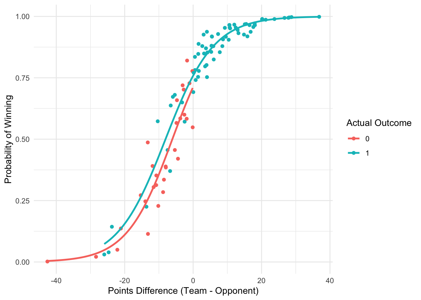
Now, when I plot the results of that logistic regression, I can see that the likelihood of a win increases as the points difference between the team and its opponent increases. When the differences is >= 20, a win (1) is almost certain!
show code for visualisation
library(ggplot2)# Predicting and visualising resultsdata$predicted_prob <-predict(model, data, type ="response")ggplot(data, aes(x = team_points - opponent_points, y = predicted_prob, color =factor(win))) +geom_point() +geom_smooth(method ="glm", method.args =list(family ="binomial"), se =FALSE) +labs(x ="Points Difference (Team - Opponent)", y ="Probability of Winning", color ="Actual Outcome") +theme_minimal()
79.3 Tree-based methods
Introduction
Tree-based methods are a powerful subset of supervised machine learning algorithms. They leverage the concept of decisiontrees, employing a hierarchical, tree-like model to facilitate decision-making processes and predictions.
Unlike linear models, which assume a linear relationship between input and output variables, tree-based methods can capture non-linear relationships, making them versatile for a wide range of data types and problems in sport.
We’ll review some of the foundational concepts of decision trees, then explore some more advanced ensemble methods like random forests and gradient boosted trees.
Decision trees
Understanding decision trees is fundamental to understanding tree-based methods in ML.
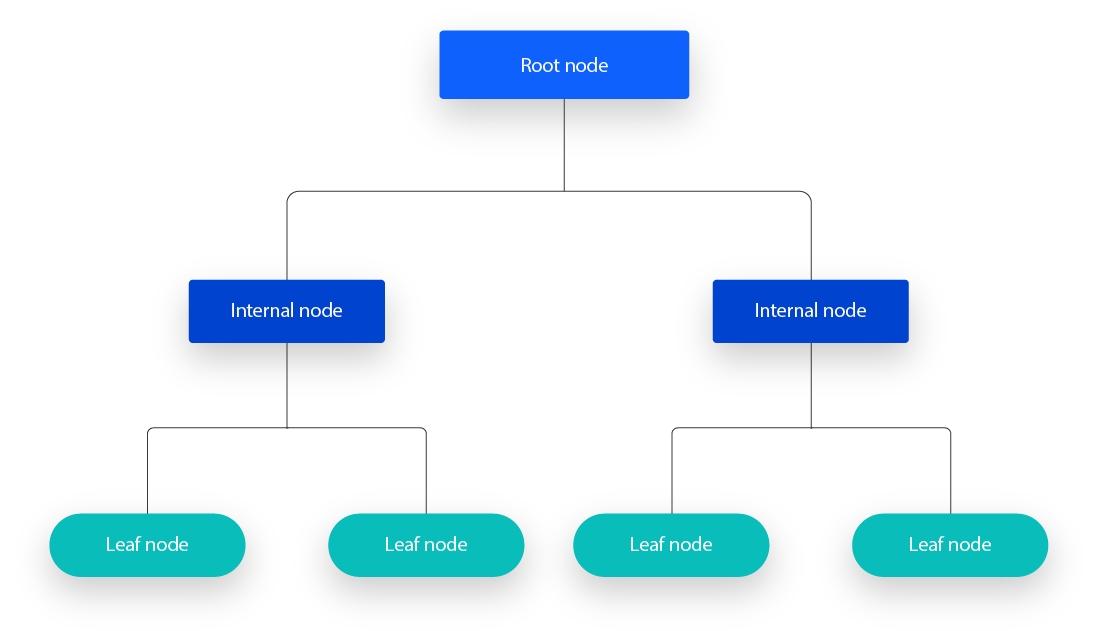
A decision tree is a flowchart-like structure where:
each internal node represents a “test” on an attribute
each branch represents the outcome of the test
each leaf node represents a class label or continuous value (in the case of regression).
the paths from root to leaf represent classification rules or regression paths.
Key concepts in decision trees include:
Entropy and Information Gain: ‘entropy’ is a measure of the impurity or randomness in the dataset. Information gain, on the other hand, measures the reduction in this entropy or impurity, helping us to decide which feature to split on at each step in the tree.
Gini Impurity: An alternative to entropy, Gini impurity measures the frequency at which any element of the dataset will be mislabeled when it is randomly labeled according to the distribution of labels in the subset. Decision trees use this criterion to make splits that increase homogeneity.
Pruning: To prevent overfitting, decision trees can be pruned. Pruning reduces the size of decision trees by removing sections of the tree that do not provide power to classify instances, enhancing the model’s generalisation capabilities.
Example of a decision tree
In this example, I’m going to create a simple decision tree model based on some sport data.
In the dataset sports_data I have some input (predictor) variables including Age, Experience, SkillLevel (categorical: High, Medium, Low). These are our features.
I also have a binary outcome variable, PlayProfessional (binary outcome: Yes, No).
Our goal is to develop a model that will accurately predict whether an individual plays at a professional level based on knowing their age, experience, and skill level.
show code for dataset creation
set.seed(123)# Generate synthetic datan <-500# number observationsAge <-sample(18:35, n, replace =TRUE) Experience <-sample(1:17, n, replace =TRUE) # Experience in yearsSkillLevel <-sample(c("High", "Medium", "Low"), n, replace =TRUE, prob =c(0.3, 0.5, 0.2)) PlayProfessional <-ifelse(Age >25& Experience >5& SkillLevel =="High", "Yes", "No")# Adding some noisenoise_indices <-sample(1:n, size =0.1* n) # Introduce 10% noisePlayProfessional[noise_indices] <-ifelse(PlayProfessional[noise_indices] =="Yes", "No", "Yes")sports_data <-data.frame(Age, Experience, SkillLevel, PlayProfessional)
Now, I’ll create the decision tree model using the rpart function:
library(rpart)library(rpart.plot)model <-rpart(PlayProfessional ~ Age + Experience + SkillLevel, data = sports_data, method ="class")
I can visualise the decision tree using rpart.plot:
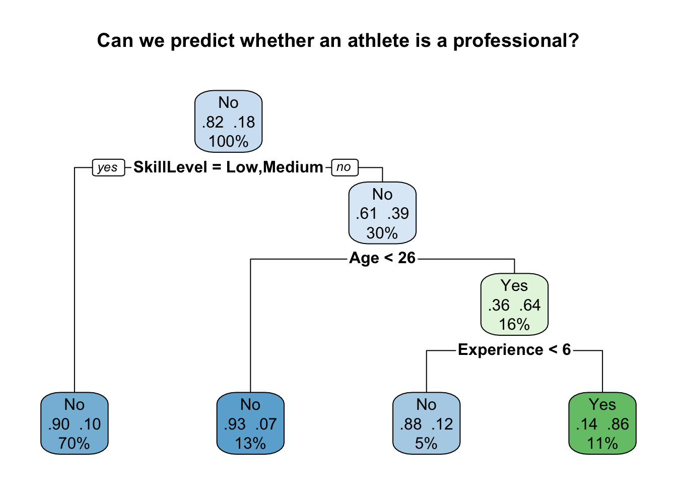
rpart.plot(model, main="Can we predict whether an athlete is a professional?", extra=104)
What does this model tell us?
The Root Node is at the top of the decision tree. It starts with the entire dataset and splits based on the most significant feature among Age, Experience, and SkillLevel.
You can see that SkillLevel is chosen for the first split due to its strong association with the outcome PlayProfessional. The tree partitions the data into groups based on SkillLevel values (High, Medium, Low). In this example, the model has decided that the data should be split into two categories; SkillLevel = low or medium (on the left), and SkillLevel = high (on the right). 70% of the dataset were allocated to the left node, and 30% of the dataset to the right.
Note that the decision is framed as a question (yes/no). You can read this as ‘is skill level low or medium? if yes, go left. If ’no’, go right.
After the initial split, we have a series of internal nodes. Each subsequent node represents a decision point that further segments the data.
For instance, if SkillLevel is “High”, the next split is Age. This is what the model has decided is best at differentiating the professional players from the amateurs within this subgroup.
In the example above, one branch represents athletes younger than 26 (the left) and the other branch represents athletes equal to or older than 26.
At the bottom of the tree we have the leaf nodes. These represent the final classifications.
For each leaf, there will be a majority class decision (Yes or No for PlayProfessional). In our example, athletes with “High” skill level, who are more than 25 years of age, and with 6 or more years of experience might overwhelmingly be classified as professional players (Yes).
Each path from the root to a leaf represents a rule that can be derived from the tree.
Mis-classification
Some leaves might show a mixture of Yes and No outcomes for PlayProfessional, especially in nodes that have been affected by noise or where the criteria are not perfectly predictive.
The proportions of Yes and No in these leaves can give you an idea of the model’s certainty, and help identify areas where the model might be less reliable.
In our example above, the model has performed extremely well in predicting that the 70% of the athletes in our dataset with low/medium experience are unlikely to be professionals. It had a 90% accuracy rate (0.90) for this category.
The model has also performed extremely well in predicting that 13% of athletes in our dataset with high experience and under 26 years of age are also unlikely to be professionals. It has a 93% accuracy for this category.
The information on the far right shows us how often the model accurately predicted ‘yes’. In this case it is 86% (note the reversal of the figures).
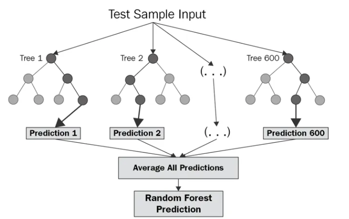
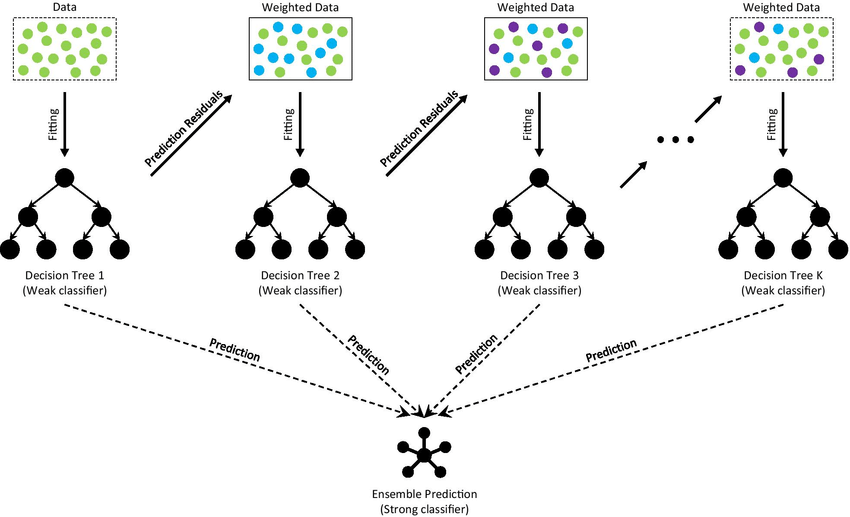
Random forests
Random forests are an ensemble learning method that operates by constructing a multitude of decision trees at training time and outputting the class that is the mode of the classes (classification) or mean prediction (regression) of the individual trees.
Ensemble methods are methods where we don’t just rely on creating one model, but rather create multiple models and combine these in different ways.
Essentially, random forests consist of running multiple decision trees, and taking the mean prediction of the individual trees.
By creating multiple models, random forests correct for decision trees’ habit of overfitting to their training set.
Key ideas in random forests include:
“Ensemble Learning”: Random forests combine the predictions of several decision trees to produce a more accurate and robust model. The fundamental principle behind ensemble learning is that a group of “weak learners” can come together to form a “strong learner.”
Bootstrap Aggregating (Bagging): This technique involves training each tree in the forest on a different bootstrap sample of the data. This diversity helps to make the ensemble’s predictions more robust than those of a single tree.
Feature Randomness: When growing each tree, random forests introduce more randomness by splitting on a random subset of features at each node. This strategy increases diversity among the trees, contributing to a more accurate and stable model.
Example of a random forest
I’m going to create a random forest on the same dataset we used for the single decision tree above.
library(randomForest)
Now, we’ll use the randomForest function to create the model. We’ll predict PlayProfessional using the same predictors: Age, Experience, and SkillLevel.
set.seed(123) sports_data$PlayProfessional <-as.factor(sports_data$PlayProfessional)sports_data$SkillLevel <-as.factor(sports_data$SkillLevel)# randomForest modelrf_model <-randomForest(PlayProfessional ~ Age + Experience + SkillLevel, data=sports_data, ntree=500, importance=TRUE)# Print model summaryprint(rf_model)
Call:
 randomForest(formula = PlayProfessional ~ Age + Experience +      SkillLevel, data = sports_data, ntree = 500, importance = TRUE)
               Type of random forest: classification
                     Number of trees: 500
No. of variables tried at each split: 1

        OOB estimate of  error rate: 10.4%
Confusion matrix:
     No Yes class.error
No  401   8   0.0195599
Yes  44  47   0.4835165
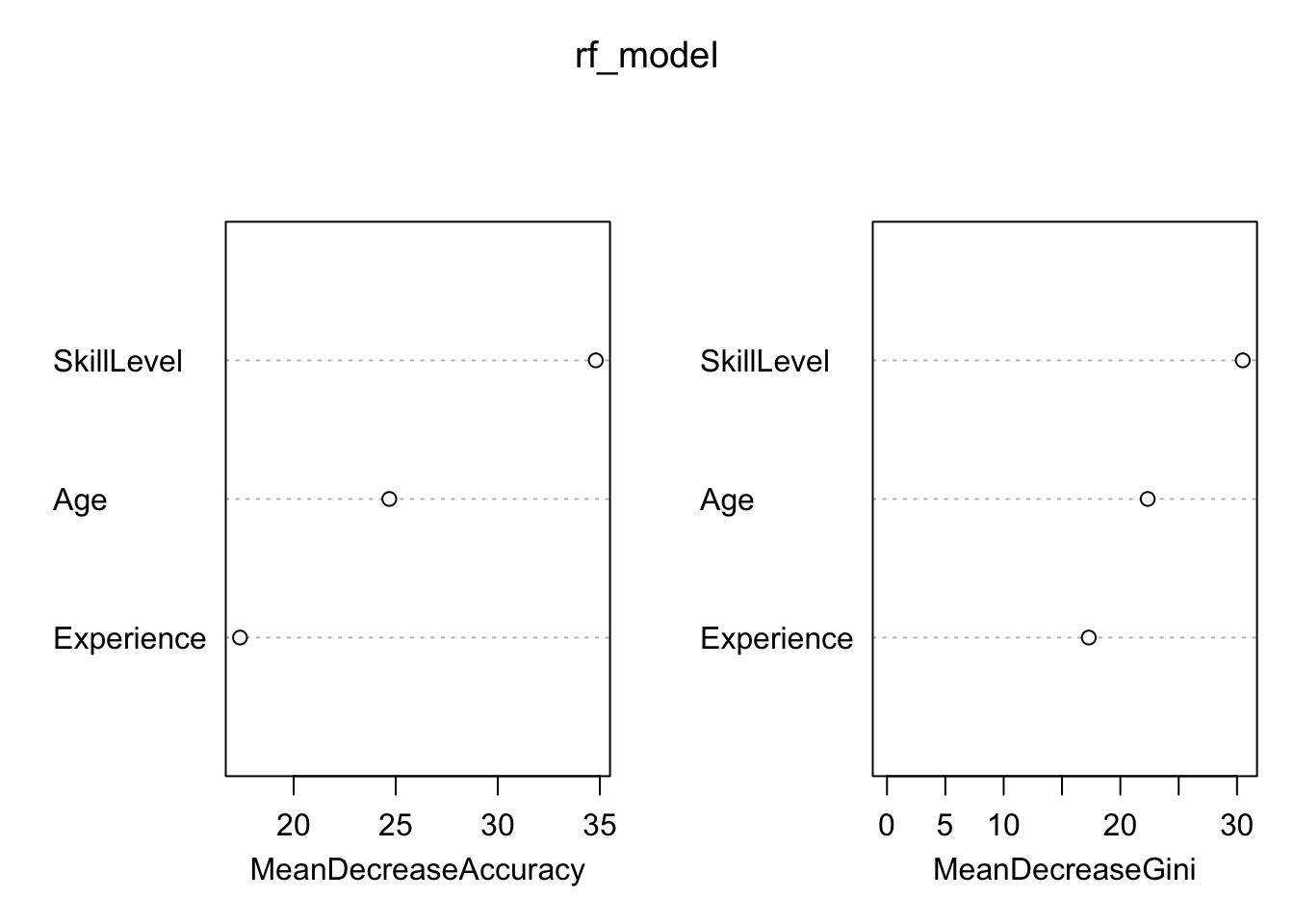
Understanding which variables are most influential in predicting the outcome can provide valuable insights. We can visualise the variable importance using the following code:
# Plot variable importance}varImpPlot(rf_model)
Finally, we’ll want to evaluate our model’s performance using a confusion matrix:
Code
# Assuming you have a separate test set called sports_data_test# predictions <- predict(rf_model, newdata=sports_data_test)# For illustration, we'll use the same dataset for predictionpredictions <-predict(rf_model, newdata=sports_data)# Evaluating model accuracyconfusionMatrix <-table(sports_data$PlayProfessional, predictions)print(confusionMatrix)
You can see from this that the model is accurate in its predictions around 90% of the time.
Gradient boosting trees
A third form of tree-based model is called ‘Gradient boosting (or boosted) trees’.
This is a powerful and effective ML technique that constructs models in a stage-wise fashion.
Like random forests, it’s a type of ensemble technique that builds one tree at a time, where each new tree helps to correct errors made by previously trained trees.
Important concepts include:
Boosting: Unlike bagging in random forests, boosting involves incrementally building an ensemble by training each new model instance to emphasise the data points that previous models misclassified.
Gradient Descent: Gradient boosting applies this optimisation technique to minimise errors in a predictive model by iteratively choosing a direction that minimises the loss function, calculated using the gradient in the multi-dimensional space of the model’s parameters.
Loss Functions: The choice of loss function in gradient boosting depends on the type of problem being solved (e.g., regression, classification). The loss function quantifies the difference between the observed and predicted values, guiding the model adjustments.
Shrinkage and Stochastic Gradient Boosting: Techniques like shrinkage, which scales the contribution of each tree by a factor known as the learning rate, and stochastic gradient boosting, which introduces randomness by training each tree on a random subset of the data, can improve model performance.
Example of a gradient boosting tree
Code
library(gbm)
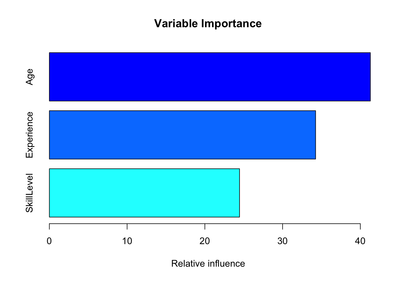
We’ll fit a gradient boosting model to predict PlayProfessional using Age, Experience, and SkillLevel. We’ll specify some parameters like n.trees (number of trees), interaction.depth, shrinkage, and n.minobsinnode.
Note: this model runs 1000 trees, so depending on your computer power it might take up to 2 minutes to run.
show code for gradient boosting model
# Convert 'PlayProfessional' to a numeric format where No = 0 and Yes = 1sports_data$PlayProfessionalNumeric <-as.numeric(sports_data$PlayProfessional) -1# Fit the gradient boosting modelgbm_model <-gbm(PlayProfessionalNumeric ~ Age + Experience + SkillLevel, data=sports_data, distribution="bernoulli",n.trees=1000, interaction.depth=3,shrinkage=0.01,n.minobsinnode=10,cv.folds =5,verbose =FALSE)# Plot variable importancesummary(gbm_model, plot =TRUE, main ="Variable Importance")
                  var  rel.inf
Age               Age 41.28952
Experience Experience 34.24693
SkillLevel SkillLevel 24.46355
show code for gradient boosting model
# Predict on the training set (ideally, we'd use a separate test set)predictions <-predict(gbm_model, newdata=sports_data, n.trees=1000, type="response")# Convert probabilities to binary outcome based on a 0.5 thresholdpredicted_classes <-ifelse(predictions >0.5, "Yes", "No")# Create confusion matrixconfusionMatrix <-table(Actual = sports_data$PlayProfessional, Predicted = predicted_classes)# Print the confusion matrixprint(confusionMatrix)
      Predicted
Actual  No Yes
   No  401   8
   Yes  42  49
show code for gradient boosting model
# Calculate and print accuracyaccuracy <-sum(diag(confusionMatrix)) /sum(confusionMatrix)print(paste("Accuracy:", accuracy))
[1] "Accuracy: 0.9"
show code for gradient boosting model
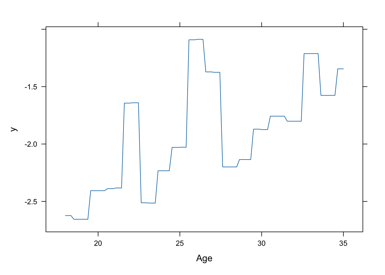
# Plot training loss over iterationsplot(gbm_model, overlay =TRUE)
From the confusion matrix, you can see that, like the random forest model, this model has also performed extremely well in predicting whether an athlete is a professional or not, based on the input features we provided.
79.4 Support Vector Machines (SVM) in R
Introduction
SVM is a powerful ML tool used for classification tasks. Imagine you have a bunch of apples and oranges mixed together and you want a machine that can automatically sort them out for you. SVM can perform that type of task.
How Does SVM Work?
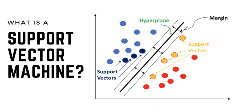
Separating Line (or ‘Hyperplane’)
Imagine drawing a straight line on a piece of paper where you have dots representing different things (like apples and oranges). SVM tries to draw a line (or in more complex cases, a curve) that best separates the two groups of dots. In 3D, this line becomes a flat surface, and we call it a “hyperplane”.
in the figure above, the separating line is the best way to divide the two groups of circles.
Support Vectors
These are the dots nearest to the line. They are crucial because they help define the best position for the separating line. The algorithm adjusts the line to be as far away from these support vectors as possible.
In the figure above, the support vectors are the circles that are closest to the separating line.
Margin
This is the distance between the line and the nearest dots (support vectors). SVM aims to maximise this margin to increase the model’s accuracy.
In the figure above, the margin is the gap between the the separating line and the closest support vectors. The wider this margin is, the better the model is at distinguishing between the two groups.
SVM in Simple Terms
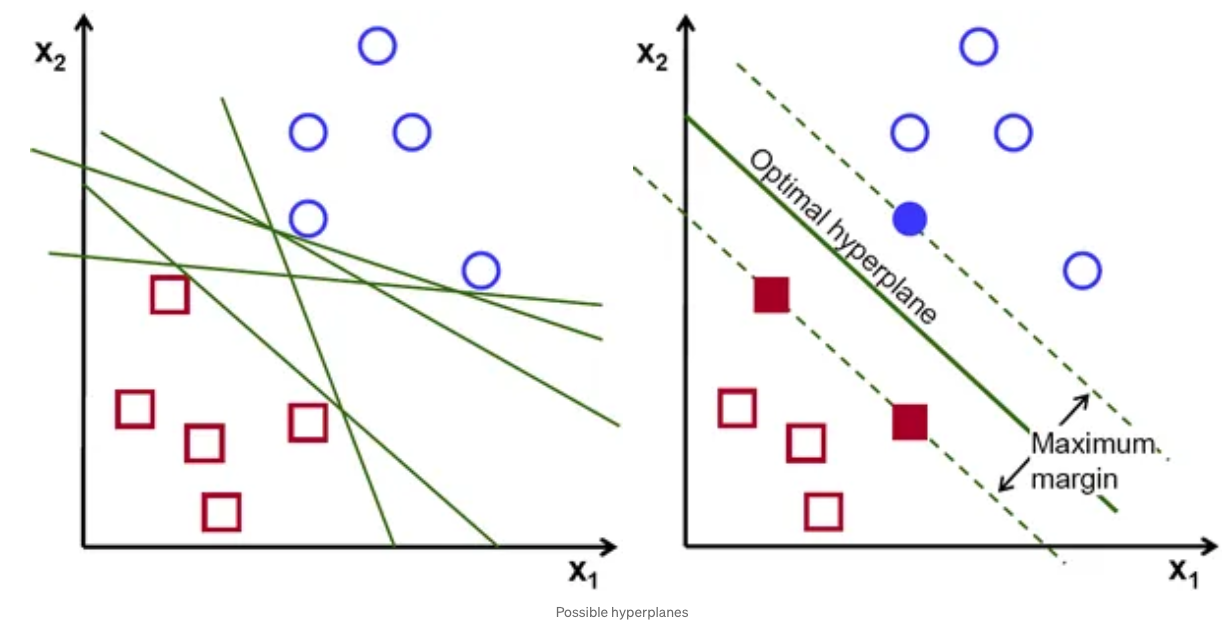
Think of SVM like a game where you have to draw a line that separates blue circles and red boxes. The best line gives the most room for each object to move without crossing to the other side.
In the figure above, on the left plot you can see that there are many different green lines that could be drawn.
In the figure above, the best line (the ‘optimal hyperplane’) is shown on the right plot.
We also call this line the ‘separating line’ or the’decision line’.
In SVM, the objects right next to the line are the most important, and they help decide where the line should go - these are called ’support vectors’.
Why Use SVM?
Accuracy: SVM is known for its high accuracy in classifying complex datasets.
Versatility: It can work well on both linear (straight line separation) and nonlinear (curved line separation) problems.
Works well with high-dimensional data: Even when you have a lot of features (like many details in a photo), SVM can handle it.
Example
Let’s imagine you want to implement an algorithm to classify your incoming emails into ‘spam’ and ‘not spam’. You might use features like the presence of certain words, the email’s length, or the sender’s details.
You would train the model on data in which these predictor variables (features) were included, with a known output variable of ‘spam’ or ‘not spam’.
SVM would find the best “line” that can separate spam emails from non-spam emails based on these features.
Implementing SVM in R
Here’s an example of a SVM in R.
Imagine we have a dataset with two features (Feature 1 and Feature 2). We also have a binary target variable (-1 or 1), which could represent ‘spam’ or ‘not spam’.
I want the model to identify the best way of deciding what a future binary outcome will be, based on the known features we provide.
First, I’ll create an example dataset:
show code for dataset creation
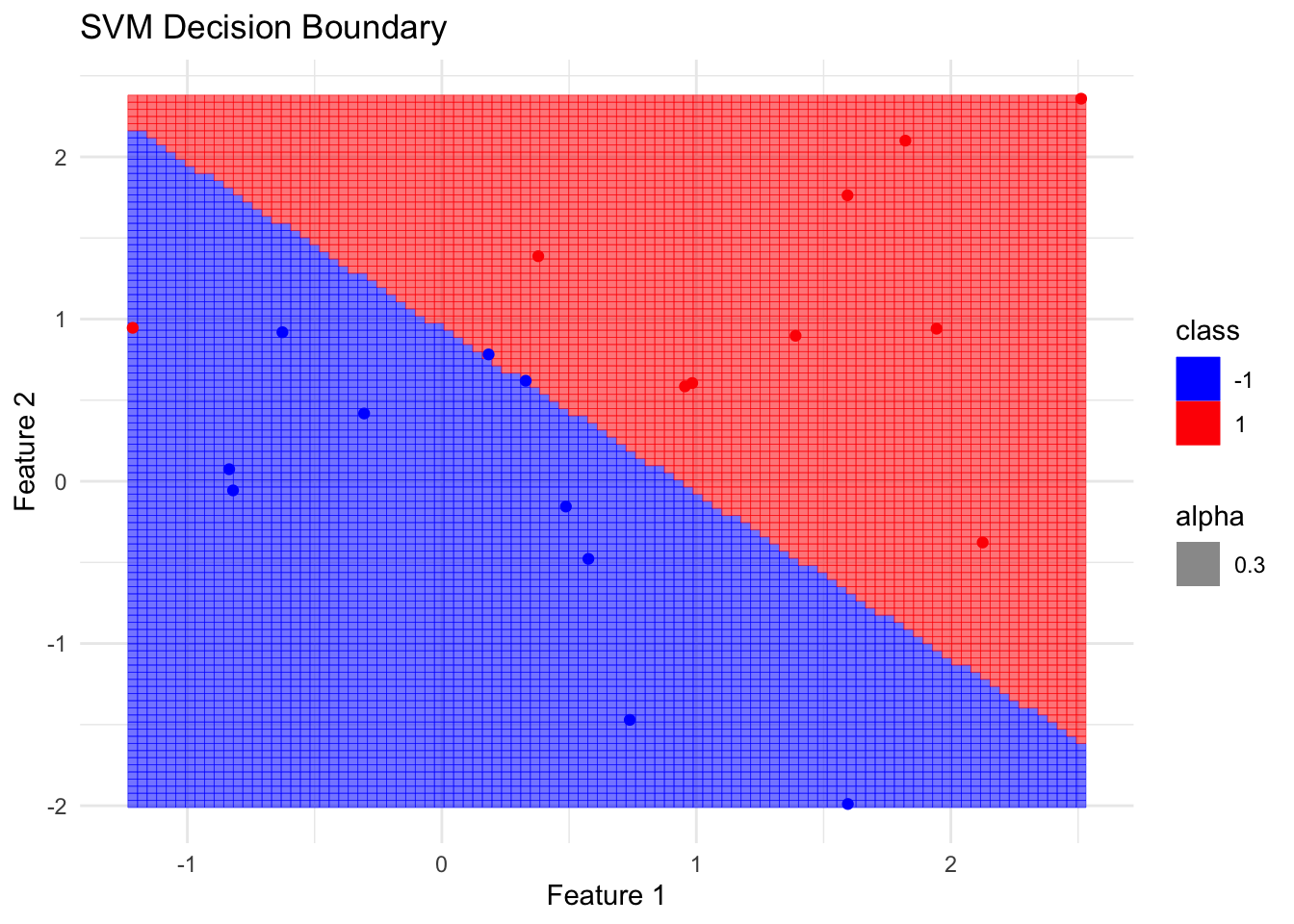
# Load the packageslibrary(e1071)library(ggplot2)# Create a synthetic datasetset.seed(1) # For reproducibilityx <-matrix(rnorm(40), ncol =2) # 20 data points with 2 featuresy <-c(rep(-1, 10), rep(1, 10)) # Binary target variablex[y ==1, ] <- x[y ==1, ] +1# Shift data to make them separable# Combine into a data framedata <-data.frame(x = x[, 1], y = x[, 2], class =as.factor(y))
Now I train the model using the svm function:
# Train the SVM modelsvm_model <-svm(class ~ ., data = data, type ='C-classification', kernel ='linear')# Create a grid to predict over the entire spacegrid <-with(data, expand.grid(x =seq(min(x), max(x), length =100),y =seq(min(y), max(y), length =100)))# Predict using the SVM modelgrid$class <-predict(svm_model, grid)
Finally, I can visualise my SVM model, focusing on the separating line which you can see best divides the two groups. It doesn’t always get it right, but it’s accurate the majority of the time.
show code for visualisation
ggplot(data, aes(x = x, y = y, color = class)) +geom_tile(data = grid, aes(fill = class, alpha =0.3), interpolate =TRUE) +geom_point() +scale_fill_manual(values =c('-1'='blue', '1'='red')) +scale_color_manual(values =c('-1'='blue', '1'='red')) +theme_minimal() +labs(title ='SVM Decision Boundary', x ='Feature 1', y ='Feature 2')
79.5 Assessing classifier performance
Assessing the performance of these classification models allows us to understand how well our models are distinguishing between different classes.
Specifically, when using the above linear classification methods, it’s vital to to systematically evaluate and interpret their predictive accuracy and generalisation capability.
Three types of tools are commonly used to assess classification models: confusion matrices, performance metrics, and ROC/AUC.
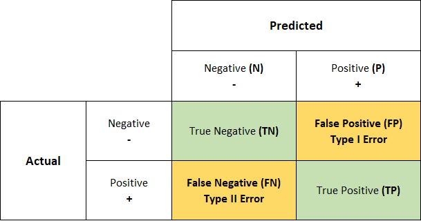
Confusion Matrices
We learned about confusion matrices earlier in the module. They are a fundamental tool used to visualise the performance of a classifier.
A confusion matrix presents the counts of true positives (TP), true negatives (TN), false positives (FP), and false negatives (FN) in a matrix format, giving a clear depiction of the classification model’s accuracy.
The confusion matrix helps us understand the nuances of each model’s performance by providing a detailed account of correct and incorrect classifications.
For logistic regression, a model that predicts categorical outcomes based on the logistic function, the confusion matrix can reveal how well the logistic curve separates the classes.
For tree-based models (like decision trees and random forests), which segment the feature space into regions, the confusion matrix can help us assess the purity of these regions in terms of class distribution.
SVMs, which focus on maximising the margin between classes, can be evaluated for how effectively they classify points on the correct side of the decision boundary using the confusion matrix.
Performance Metrics
From the confusion matrix, several performance metrics can be derived that are useful for model evaluation:
Accuracy: We can calculate the proportion of correctly predicted observations to the total observations. While it provides a quick snapshot of performance, accuracy alone can be misleading, especially in imbalanced datasets.
Precision: We can also explore the ratio of true positives to the sum of true and false positives. This metric is crucial when the cost of a false positive is high.
Recall (Sensitivity): This is the ratio of true positives to the sum of true positives and false negatives. It is particularly important when the cost of a false negative is significant.
F1 Score: This represents the harmonic mean of precision and recall. It is a balanced metric that is useful when you need to balance precision and recall.
What’s the harmonic mean?
The harmonic mean is a type of average, often used in situations where we want to find the mean of rates or ratios. It’s particularly effective when the numbers are defined in relation to some unit (e.g., speed, density) and you want to average them.
These metrics can serve different purposes based on the context of the classification task and the specific model employed.
For instance, in logistic regression, we might focus on precision and recall when dealing with imbalanced classes.
On the other hand, tree-based models, which can handle non-linear data, might require an in-depth look at the F1 score to balance precision and recall, especially in complex datasets.
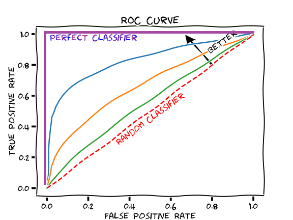
ROC/AUC
The Receiver Operating Characteristic (ROC) curve and the Area Under the Curve (AUC) are powerful methods to assess classifier performance.
The ROC curve plots the true positive rate (sensitivity) against the false positive rate (1 - specificity) at various threshold settings.
The AUC gives a single measure of a model’s performance across all threshold values, providing a clear and comprehensive evaluation.
In logistic regression, ROC/AUC can show how well the logistic function separates the classes at different thresholds. For tree-based models, the ROC curve can illustrate the effect of different splitting rules and depths on the model’s performance. In SVMs, the ROC curve can help visualise the trade-off between classifying points correctly and maximising the margin.